Artwork Guidelines
One small mistake in your artwork file, and the final box might not match your brand’s vision. It could be a color mismatch, a blurry logo, or text that's way too close to the edge. These things seem minor until they show up on a few thousand printed boxes. That’s why artwork guidelines exist!
They’re not just rules; they’re your safety net. We’ll break down the key artwork guidelines for custom packaging boxes simply, clearly, and without the jargon. By the end, you’ll know exactly what to check before hitting that “send to print” button.
Color Mode
Color is one of the first things people notice about your packaging. The colors you see on your screen are not always what ends up on your box.
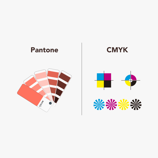
Most digital designs start out in RGB mode (Red, Green, Blue) because that’s how screens work. But printers don’t use RGB. Instead, they use CMYK (Cyan, Magenta, Yellow, Black). If you don’t switch to the right mode early, your final print might look dull, overly dark, or just… off.
So, always design your artwork in CMYK mode if you’re using standard printing methods. This gives you a more realistic preview of how your packaging will actually look when printed.
If you need precise color matching, especially for brand colors, go one step further and use Pantone (PMS) spot colors. Pantone inks are pre-mixed and consistent, so they’re great when you want that exact shade of blue or a specific gold foil every single time.
Moreover, don’t rely on your monitor for final color decisions. Always request a printed proof or a Pantone color swatch to see the true color in physical form.
Fonts and Text
Fonts can make or break the readability of your packaging. On a screen, you can zoom in, change your view, or adjust settings to make text clearer. But once your design goes to print, there’s no second chance.
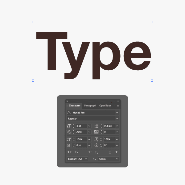
Stick to a minimum of 9pt for body text. Anything smaller can easily become hard to read, especially when printed on textured or colored packaging materials. For key details like ingredients, product names, or usage instructions, going slightly larger ensures clarity across all lighting conditions.
Avoid overly decorative fonts, especially cursive or script styles. They might look stylish in digital mockups, but in print, they often lose their sharpness and can appear blurry or cramped.
Here’s a simple rule to follow:
If your font needs a second glance to be read, it’s not the right font for packaging.
Also, be mindful of font weights and contrast. Thin fonts in light colors on a light background might look elegant, but they usually don’t perform well in real-world packaging.
Resolution
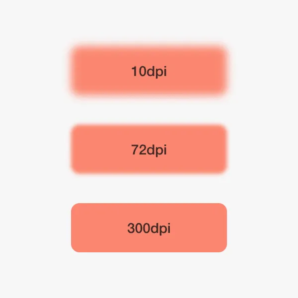
Always design your artwork at a minimum of 300 DPI (dots per inch). This is the industry standard for print and ensures that text, logos, and images stay crisp when transferred to your packaging. Anything lower, like 72 or 150 DPI, which is often used for web graphics, won’t cut it. On a printed box, that lower resolution turns into fuzziness or jagged edges.
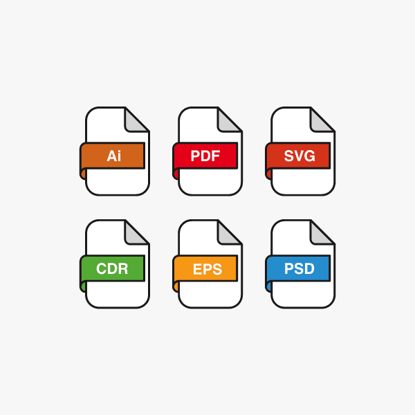
Better yet, use vector files (like .AI, .EPS, or .SVG) for logos and illustrations whenever possible. Vectors can be scaled infinitely without losing quality, which makes them perfect for packaging of all sizes.
Also, watch out for image compression. Some tools, especially free online design platforms, automatically compress images, reducing quality without you realizing it. When sending final artwork to your packaging supplier, always export files in high resolution, and avoid formats like JPEG if your design includes text over backgrounds. PNG, PDF, or layered PSDs are usually safer.
Finally, don’t forget to zoom in on your design at 100% (or even 200%) before sending it for print. It’s a quick way to catch resolution issues, fine print errors, or graphics that don’t align properly.
File Formats
Once your packaging design is ready, send it in a print-ready format—preferably a high-res PDF with embedded or outlined fonts and correct color profiles (CMYK or Pantone). Use TIFF or EPS for high-res images; avoid Word, PowerPoint, or Canva unless exporting to PDF. JPEG or PNG are fine for image elements only, at 300 DPI or higher.
Quick checklist:
Fonts outlined or embedded
Images at 300 DPI
CMYK or Pantone color profile
Layers labeled (for finishes)
Final file as high-res PDF or TIFF
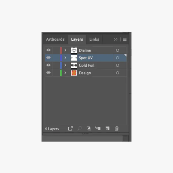
File Organization
Clean artwork is key—but so is a clean, organized file. A well-structured design file saves time, reduces errors, and makes life easier for your team or packaging supplier.
Best practices:
Use separate, clearly labeled layers (e.g., “Dieline – Do Not Print,” “Foil Layer”).
Name files descriptively—not “final_v3_FIXED.pdf”.
If sending multiple files, zip them with a short readme.txt explaining what’s inside.
Clear files lead to cleaner prints—and smoother workflows.